



Most studios don't have a metrics problem. They have a definitions problem.
Ask three people at the same school what "active members" means and you'll get three different answers. Front desk counts everyone with a login. The owner counts everyone billed this month. The head instructor counts everyone who actually showed up in the last two weeks. All three are technically right, which is exactly why nobody trusts the number — and why the Monday meeting turns into an argument about whose spreadsheet is correct instead of a conversation about what to do next. This is the core failure. A martial arts studio KPI dashboard is only as useful as the agreement underneath it. If the data isn't canonical — one source, one definition, one owner per number — then every chart on the wall is a well-designed guess. This post is about fixing the plumbing first, then the dashboard, then the cadence that turns the dashboard into actual decisions.
Why studio dashboards lie (and everyone believes them anyway)
The polished dashboard is seductive. Green numbers, trend arrows, a nice retention curve. It feels like control. But the prettier the dashboard, the less anyone questions where the numbers came from — and that's when bad data does the most damage.
-
Two systems, one metric. Billing lives in one platform, attendance in another, leads in a spreadsheet. "Revenue per member" pulls from billing, "engagement" pulls from attendance, and nobody ever reconciled the two. A member who froze their account can still show as active in attendance exports for weeks.
-
Manual counts that drift. Someone updates a Google Sheet every Friday. They miss two Fridays in December. Now your Q4 churn number is quietly wrong, and you're making a January staffing decision on top of it.
-
Definitions that changed without notice. Last year "trial conversion" meant trials that bought anything. This year the new manager only counts trials that bought a full membership. The number "dropped 15%" — except it didn't. The definition moved.
The real damage isn't the wrong number. It's the confident wrong decision. A studio cuts a Tuesday kids' class because the dashboard says attendance is low — but attendance was low because the reminder automation broke, not because demand dried up. Three months later they've lost students who would have come back, and the dashboard now shows a real problem that started as a data glitch.
Start with canonical data sources, not charts
Before you design a single tile, decide where each number lives and who owns it. This is the least glamorous part and the only part that matters long term.
Simplify class bookings and attendance tracking.
Dojoyly helps you schedule, confirm, and manage every class effortlessly.
- Unified class & student management
- Automated member notifications
- Instructor scheduling & availability
No credit card required
A canonical source means: for any given metric, there is exactly one system of record. Not "usually billing." Not "we cross-check." One source. Everything else references it.
| Data domain | Canonical source | Owner | Export cadence |
|---|---|---|---|
| Memberships & billing | Billing/CRM platform | Owner / office manager | Nightly |
| Attendance / check-ins | Check-in system | Head instructor | Nightly |
| Leads & trials | CRM pipeline | Front desk lead | Weekly |
| Staff hours & pay | Payroll/scheduling | Office manager | Bi-weekly |
| Refunds / freezes / cancels | Billing platform | Owner | Weekly |
Version your export specs so changes are visible and auditable.
Two rules make this hold together:
-
Every metric names its source. On the dashboard itself, each tile should carry a small note: source: billing, updated nightly. When someone questions a number, the answer is immediate instead of a two-day investigation.
-
Exports have specs, not vibes. Decide the exact fields, the date format, the timezone, and how frozen/cancelled statuses are flagged — before anyone builds a report on top of them. A membership export that doesn't distinguish "active," "frozen," and "pending cancellation" will corrupt every retention number you pull from it.
If you're running more than one location, this gets harder fast. You're now reconciling exports across sites that may have configured their systems differently. The multi-site operations playbook goes deeper on keeping SOPs consistent across locations — canonical data definitions belong in that same binder. A "member freeze" at your downtown location has to mean the exact same thing as at your suburban one, or your combined dashboard is fiction.
The metrics that actually run a studio (with formulas)
You don't need forty metrics. You need maybe eight to ten that connect to a decision. If a number doesn't change what you'd do, it's decoration.
Active Member Count
= members with a live, billable status as of the report date (exclude frozen, exclude pending-cancel)
Use: your denominator for almost everything. Get this wrong and every ratio below is wrong too.
Monthly Recurring Revenue (MRR)
= sum of active recurring membership value, normalized to a monthly figure
Use: the truest single read on studio health. Annual paid-in-full memberships get divided across their term so one big January payment doesn't fake a spike.
Net Member Change
= new members this period − (cancels + non-renewals) this period
Use: tells you if you're growing or leaking. A studio can add 12 members and still shrink if 15 walked out the back door.
Churn Rate
= members lost during period ÷ active members at start of period
Use: the leak size. Watch the trend, not the single value — a jump from ~3% to ~6% monthly is a fire alarm even if 6% sounds manageable in isolation.
Trial-to-Member Conversion
= trials that converted to paid ÷ trials that ended this period
Use: measures your intake and first-30-days process, not your marketing. If leads are strong but this is weak, the problem is inside the building.
Attendance Rate per Class
= actual check-ins ÷ enrolled/capacity for that class slot
Use: your scheduling truth. This is what tells you whether to add, move, or cut a class — assuming the check-in data is clean.
Revenue per Active Member (ARPU)
= MRR ÷ active member count
Use: catches silent discount creep. If ARPU drifts down while headcount is flat, you've been giving away rate without noticing.
Failed Payment Rate
= failed charges ÷ total charge attempts
Use: an early revenue leak indicator. A rising failed-charge rate looks like churn on your MRR line but is often just expired cards. This ties directly into having a real dunning and retry workflow — the metric tells you the leak exists, the workflow plugs it.
These metrics are a chain, not a list. Leads feed trials, trials feed active members, active members feed MRR, MRR divided by count gives ARPU, and failed payments quietly drain the whole thing. A good dashboard shows the chain so you can see where it breaks, not just that revenue moved.
[Leads] → [Trials] → [Active Members] → [MRR] ↑ [Failed Payments drain here] ↓ [ARPU] Understanding this flow is the difference between reacting to individual numbers and actually diagnosing where the problem started.
Dashboard wireframes: weekly vs monthly cadence
The mistake most owners make is building one giant dashboard and staring at all of it, all the time. That's how you end up reacting to noise. Weekly numbers and monthly numbers answer different questions and belong on different screens.
The weekly board — "is anything on fire?" This is operational. It's for the Monday huddle. Keep it to what a team can actually act on inside seven days.
┌─────────────────────────────────────────────┐ │ WEEK OF: ____ Source stamps on all │ ├──────────────┬──────────────┬───────────────┤ │ New Trials │ Trials Ended │ Conversions │ │ this wk │ this wk │ this wk │ ├──────────────┼──────────────┼───────────────┤ │ Failed │ Cancels │ Attendance │ │ Payments │ Requested │ Rate (avg) │ ├──────────────┴──────────────┴───────────────┤ │ ATTENDANCE BY CLASS SLOT (heat strip) │ │ Mon▓ Tue░ Wed▓ Thu▓ Fri░ Sat▓ ← flags low │ ├───────────────────────────────────────────────┤ │ ACTION QUEUE: items flagged by rules below │ └───────────────────────────────────────────────┘
The monthly board — "are we winning?" This is strategic. For the owner, maybe a business partner or bookkeeper. Trends, not snapshots.
┌─────────────────────────────────────────────┐ │ MONTH: ____ vs prior 3-mo avg │ ├──────────────────────┬──────────────────────┤ │ MRR trend (12 mo) │ Active member trend │ │ ▁▂▃▄▅▆▇█ │ ▁▂▂▃▃▄▄▅ │ ├──────────────────────┼──────────────────────┤ │ Churn % (6 mo) │ ARPU (6 mo) │ ├──────────────────────┴──────────────────────┤ │ Net member change | Trial conversion rate │ ├───────────────────────────────────────────────┤ │ Cohort retention: 30 / 90 / 180-day survival │ └───────────────────────────────────────────────┘
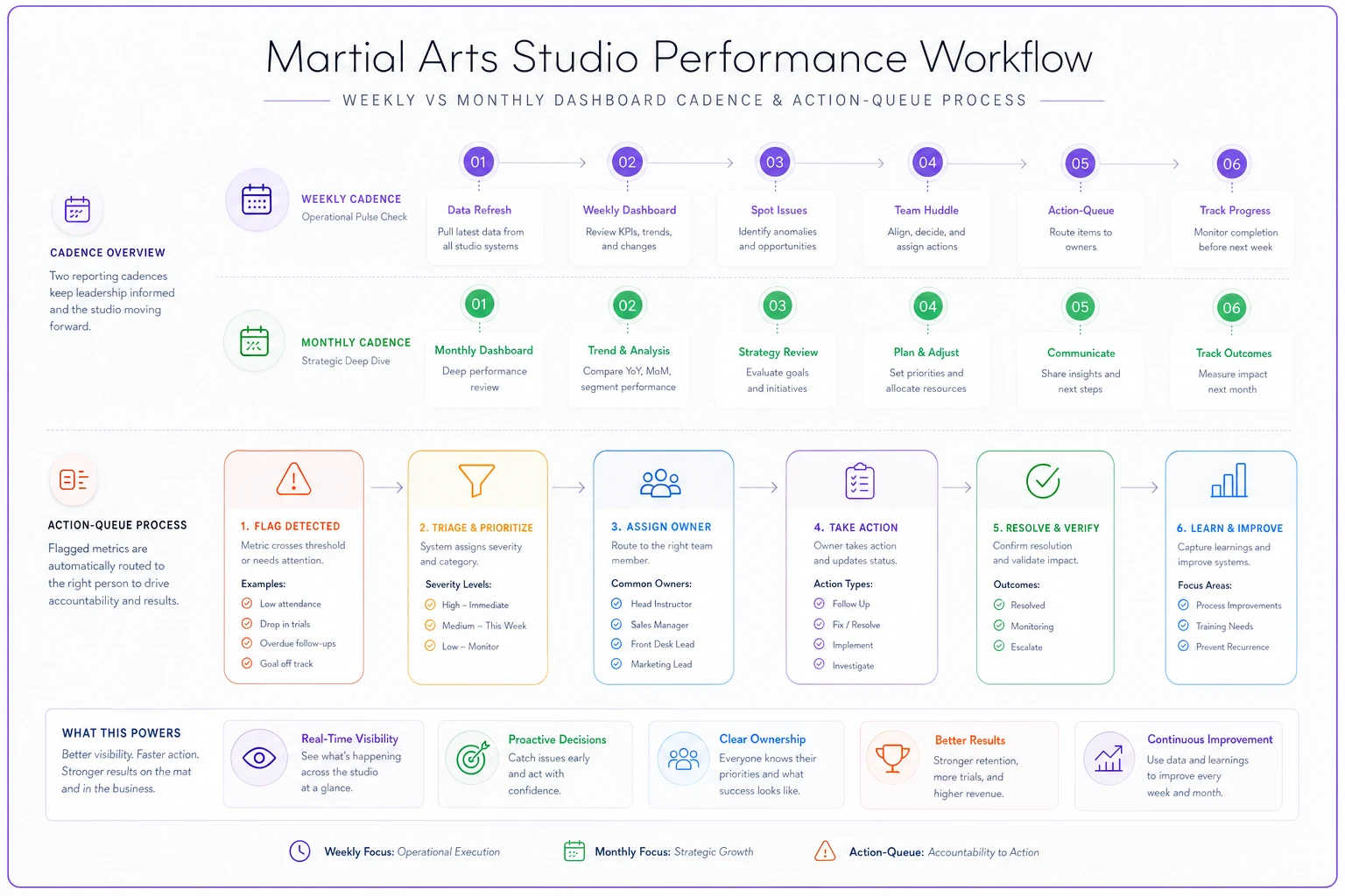
A simple visual of the cadence and the action queue helps teams see what to focus on each meeting without mixing timeframes.
One rule worth pushing hard on: the weekly board should never show MRR trends and the monthly board should never show this week's individual failed charges. Mixing timeframes is how owners end up anxious about a two-day dip that's inside normal weekly variation. Different cadence, different questions, different screen.
For the financial half of the monthly view — actual P&L, per-class profitability, cashflow — that deserves its own dedicated rhythm. The weekly cashflow cadence and P&L templates cover the money side in a way that pairs well with the member-side metrics here.
Data-quality checks: the part everyone skips
A dashboard without quality checks is a car with no oil light. Everything looks fine right up until it doesn't. These checks should run against your nightly exports and flag anomalies before anyone makes a decision on them.
-
Row count sanity. If yesterday's active-member export had 312 rows and today's has 190, something broke in the sync — that's not 122 people quitting overnight.
-
Zero/null spikes. A sudden cluster of blank attendance records usually means the check-in tablet went offline, not that nobody showed up.
-
Reconciliation between sources. Active members in billing should roughly match active members with recent attendance. A widening gap means one system is stale.
-
Timezone / date-boundary drift. Check-ins logging at "11
58 PM" that should belong to the next day's class is a quiet, slow corrupter of daily numbers.
-
Definition version tag. Every metric should store which definition version produced it, so when you change how "conversion" is counted, old numbers don't get silently compared to new ones.
Here's the escalation logic — this is what turns a flagged anomaly into a resolved one instead of a number nobody trusts:
-
Check runs nightly. Any metric that fails a quality rule gets flagged, not published.
-
Flag routes to the owner of that data source. An attendance anomaly goes to the head instructor, not into a shared inbox where it disappears.
-
24-hour rule. If a flagged number isn't confirmed or corrected within a day, it shows on the dashboard as "under review" — visible, but explicitly not trusted.
-
Repeat offenders get a fix, not a patch. If the same check fails three weeks running, the problem is the export spec or the process, not the data. Fix the source.
The goal isn't zero anomalies. Anomalies are normal. The goal is that no anomaly ever silently makes it into a decision. A flagged, honestly-labeled "we're not sure about this number" beats a clean-looking wrong number every single time.
Turning metrics into actions with escalation rules
Numbers on a screen don't do anything. The gap between a metric crossing a threshold and a human actually doing something is where most dashboards fall apart — the number goes red, everyone nods, and nothing changes.
The fix is writing the rule before the number moves. Pre-committed thresholds remove the debate in the moment.
| Metric | Watch threshold | Action threshold | Who acts |
|---|---|---|---|
| Monthly churn | > ~4% | > ~6% | Owner reviews cancel reasons |
| Failed payment rate | > ~5% | > ~8% | Trigger dunning review |
| Trial conversion | < ~50% | < ~35% | Audit intake / first 30 days |
| Class attendance | < 60% capacity | < 40% for 3 wks | Reschedule or consolidate |
| ARPU | drifting down 2 mo | down 3+ mo | Review discount policy |
Two things make this work. First, there are two thresholds per metric — a watch level and an action level. This stops you from either ignoring slow drift or overreacting to a single bad week. Second, every action has a named owner. "The team should look into it" is where accountability goes to die.
In practice: the nightly export runs, quality checks pass, metrics update, and any metric past its action threshold drops an item into the weekly board's action queue with the owner attached. Monday huddle, you don't review everything — you review the queue. The dashboard did the filtering; the meeting does the deciding. When the queue is empty, the meeting is short, and that's fine.
A real scenario: the class that "wasn't working"
A mid-sized studio — around 240 active members, two full-time instructors and a handful of part-timers — was convinced their Tuesday/Thursday evening adult program was dying. The attendance dashboard showed slots running around 40% capacity and trending down. The owner was a week away from cutting Thursday entirely and moving the instructor's hours.
The problem was upstream. Their check-in tablet at the second entrance had been dropping connection intermittently since a router change, and roughly a third of Thursday evening check-ins simply weren't logging. Real attendance was closer to 65–70%. The class was fine. The data was broken.
They caught it only because someone reconciled billing-active members against attendance and noticed the gap didn't make sense — dozens of members billing every month with almost no recorded check-ins, clustered on the same nights. That's exactly what a row-count and reconciliation check is supposed to catch. They just did it by hand, too late.
After fixing the export path and adding the nightly reconciliation check, the picture flipped. Instead of cutting a healthy class, they left it alone and redirected attention to a genuinely weak Saturday morning slot the clean data actually flagged. Over the next quarter, keeping Thursday intact preserved somewhere in the range of a few thousand dollars a month in memberships tied to those students' routines.
The outcome that mattered most wasn't the money saved. It was that the owner stopped trusting the dashboard blindly and started trusting the checks behind it. That's the whole game.
When a full KPI dashboard is overkill
Not every studio needs this. If you're running one location with under ~80 members and you personally know every student by name, a heavy dashboard with escalation rules is process for its own sake. You already are the reconciliation check. A simple weekly glance at new members, cancels, and failed payments is plenty.
-
You've crossed the point where you can't personally track every member's status — usually somewhere north of 150–200 members.
-
You've hired staff who make operational calls (scheduling, follow-up) without you in the room.
-
You're running or opening a second location and need numbers that mean the same thing in both places.
Building a forty-tile dashboard before your data sources are clean is actively counterproductive. A beautiful dashboard on top of two unreconciled systems just gives you faster, prettier wrong answers. Plumbing first. Always.
Where software fits — quietly
Everything above can be run on spreadsheets and discipline. Plenty of studios do exactly that for years. The reason owners eventually move to an operational platform isn't the charts — it's the parts that break when they depend on a human remembering: the nightly exports, the reconciliation checks, the anomaly flags routing to the right person, the definition-version tags so numbers stay comparable over time.
That's where AI-assisted operational tools genuinely earn their place — not by generating fancier dashboards, but by running the boring quality checks every night without fail, catching the row-count drop or the null-spike before it reaches your Monday meeting, and surfacing a clear "this number looks wrong, don't trust it yet" before someone acts on it. The judgment stays with you. The tedious watchfulness gets automated. That division of labor is the point.
The bottom line
A martial arts studio KPI dashboard doesn't fail because the metrics are wrong. It fails because the definitions were never agreed on, the sources were never made canonical, and the checks that would have caught bad data were never built. Fix those three things and even a plain spreadsheet becomes something your whole team can make decisions on.
Start narrow: pick eight core metrics, name one canonical source and owner for each, write the export spec, add two or three quality checks, and set watch/action thresholds before you need them. Get that foundation solid and the dashboard on top of it will finally do what you always wanted — not decorate the wall, but tell you what to do next.
Ready to elevate your dojo operations?
Join 500+ martial arts studios using Dojoyly to save time, reduce scheduling conflicts, and improve member engagement.